When I’m reading a story – in comics or otherwise – I do my best to notice and evaluate all of the elements that the creator or creators have included. It’s easy for me to do in novels; years of English classes from grade school through grad school taught me how to discern the messages that authors included below the surface of the text. I sharpened my skills by learning to do similar interpretations of television and movies… and then I discovered comics.
In a novel, the author’s writing style or choice of details can be the difference between the story being the next Harry Potter or a complete flop. In comics, there’s a delicate balance between the story and the art – they really have to work together to deliver the finished product to the reader in a way that novels don’t have to worry about. If the story isn’t great but the art is, the art might be able to sell the story for a while, but probably won’t be able to carry it for too long; the same goes for a brilliant story with terrible art. A book with an okay story and okay art will probably hang around for a bit, but won’t really succeed.
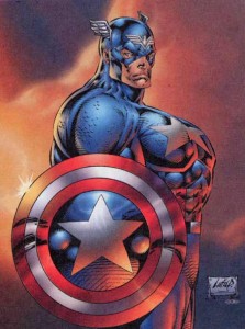
Occasionally, an interesting story with art that is otherwise good has a panel that makes you cock your head, which can take you out of the story and potentially lessen your enjoyment of the issue or arc as a whole.
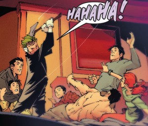
For the most part, the story and the art in any given comic really do work together to present a cohesive narrative. There might be a panel here or there the makes you raise an eyebrow, or a line that sounds really weird for the character you’re reading, but a lot of that can be attributed to how often the creative teams behind a given comic change. Transitions between writers and artists can sometimes create some hinky things, though they tend to smooth over eventually.
Every once in a while, though, there’s a comic with a creative team that isn’t just on the same page, or even in the same paragraph – it’s like the author and the artist are finishing each others’ sentences. The words wouldn’t be able to tell the story on their own, nor would the art, but together they make a masterpiece. The current run of Hawkeye is that kind of book.
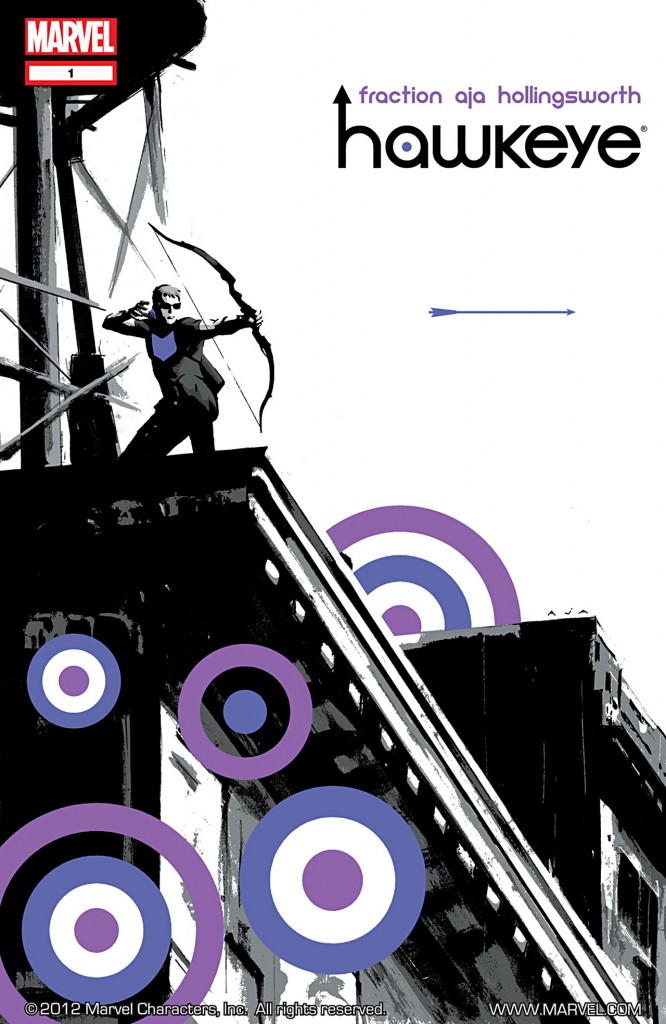
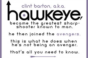
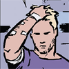 Writer Matt Fraction works with artists David Aja and Javier Pulido as well as colorist Matt Hollingsworth to tell us all about Clint Barton, known to comic fans and moviegoers worldwide as Hawkeye. Unlike in a lot of heroes’ solo titles, we don’t get a look at Hawkeye’s solo stints; instead, we get a glimpse into what Clint is doing when he isn’t being an Avenger.
 We also get to see Clint team up with Kate Bishop, who also goes by the codename of Hawkeye. (Clint was a ninja for a while. Sort of. It’s complicated.) She’s smart and sassy and is constantly in place to take Clint down a peg when he gets a little too full of himself, but is also always in there for Clint when he’s having a bad time. She isn’t his sidekick; she’s fully a hero in her own right. Their friendship is one of the high points in a book full of really great things.
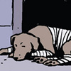 The other main character to date is Pizza Dog, the dog that Clint rescued and sort of unintentionally adopted. Pizza Dog was originally named Arrow; Clint changed it to Lucky, but he’s widely referred to as Pizza Dog by creators and fans alike, since he came to Clint’s rescue in the first issue after Clint fed him a slice of pizza.
The art style that Aja and Pulido use doesn’t have your standard superhero comic look. With allowances given for differences in how individual artists draw, a lot of art in superhero comics looks the same; you have your heavily muscled heroes with form-fitting costumes and then you have your villains in quirky, borderline-ridiculous costumes. (Sometimes they skip “borderline” and go straight to outright ridiculous.) That isn’t so in Hawkeye; in the first issue, Clint’s major fight scene is done with him in business casual…
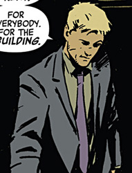
…and his opponents are dressed in track suits.
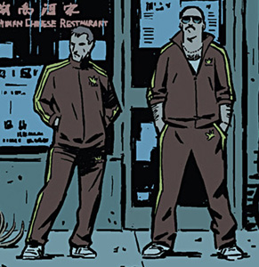
It adds a sense of realism to the whole idea that Clint is just a guy with a weird skill set who deals with bizarre problems, but is ultimately just a regular person. He doesn’t wear a stylized American flag on his chest, nor does he have an armored suit or magical abilities or anything like that. He’s just Clint, and his enemies are, for the most part, the kind of bad guys you hear about on the news, not the fantastic kinds of enemies you encounter in a lot of superhero titles. The way that they’re drawn brings that realism into the characterization that Fraction writes. It all works together to really make you feel like you’re reading more about Clint Barton, a regular guy with a serious case of sarcasm and pretty awful luck, instead of Hawkeye, Avenger of the Day.
Another thing that makes the art essential to the story in this book is that it really gives you the sense that you’re seeing things as Clint sees them. It’s not drawn as if it’s snapshots of the action; instead, you get a very Clint-flavored view of his surroundings.
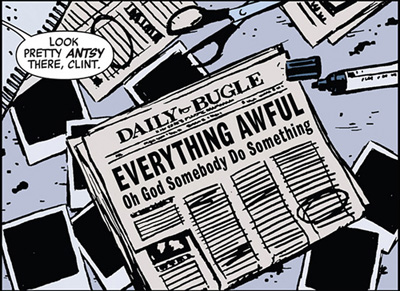
This isn’t to say that the art is inaccurate; I think it’s more realistic, in a way, than more accurately rendered art would be. In a book that’s giving us Clint behind the scenes, it makes sense that things are shown to us as he sees and interprets them. It’s a great example of how the art adds to the overall story in a way that the writing wouldn’t be able to convey.
The style is also fairly simplistic. It’s not quite sketchy, but it doesn’t have the polished feel that a lot of other books have – which is absolutely part of its charm. There’s also a definite throwback feel to some of the art, and that retro look helps set the tone as well. Again, it adds to the feel of this being Clint’s story told from Clint’s point of view.
The art also does some really cool things with timing. Clint is an archer; being on downtime doesn’t change that. There are a lot of instances of him using his archery in non-Avengers-related situations; we also get a lot of panels with him practicing his archery. Sometimes we’re shown how Clint uses it as a sort of stress relief; other times we get to see how he uses it to intimidate the mobsters that are trying to intimidate him and the rest of the people in his apartment building. The really neat thing that stood out to me, though, is how, in one practice scene, we see him thinking through the steps he takes in order to make a clean shot – and we see how quickly he does that.
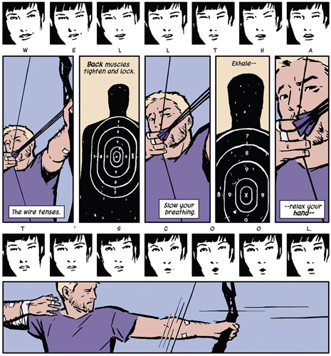
The art does a great job of illustrating everything that goes into that kind of shot, from drawing the bow to firing. The way it’s done – comparing the thought processes and movements how long it takes Kate to say “That’s cool” – really brings home how skilled Clint is at what he does. Fraction could easily have chosen to have Clint say something about how fast he can shoot, but having Aja show us that it only takes him a handful of seconds – maybe even less that that – to nail a shot in a practice situation goes a lot further than listening to Clint either brag about or downplay his abilities.
Of course, the art can also be used to convey a lot of jokes that wouldn’t make sense in the printed word. In Hawkeye #3, Clint meets a woman and ends up sleeping with her… only to have the track suit-wearing bad guys from earlier in the series show up with automatic weapons. Clint and his lady friend are just rolling out of bed, and they haven’t quite gotten to the clothing stage of getting ready yet, so we get this:
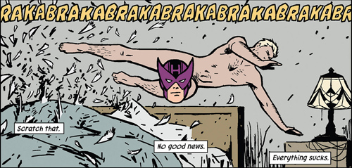
The way the art is used here is a stroke of genius, and there’s no way that I’ve been able to think of to convey the same kind of humor without that little helmet firmly in place. Sure, Clint could say something like “Yeah, it sucks to fight naked,” but it loses a lot of the effect in the explanation.
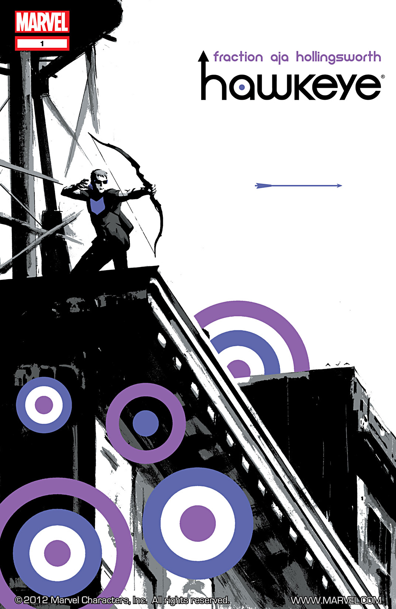
The coloring that Matt Hollingsworth does in the book deserves its own mention. By using a limited palette based largely in purples – Hawkeye’s traditional color of choice – Hollingsworth is able to help create a really striking comic. It sets the tone of the series, and is used to great effect – when something isn’t in the muted purples and grays that we’re used to seeing, you know that it’s something that you need to notice. It stands out right away, and so far, it’s been extremely effective.
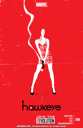
There are a lot of comic books in which the art and the writing work together to present you with a cohesive story, but the team behind Hawkeye has really taken it to a new level. The art is eye-catching, the colors are interesting, and the writing is excellent. It’s a book that I almost always read the second I get my hands on it – I can’t wait to see what they’ve done next. And even better – there are always new things to notice on a reread, little details that you wouldn’t see until you had the whole story already in your head. It’s an excellent read. (And rumor has it that Pizza Dog is running the show next issue. If that doesn’t sell Hawkeye, I don’t know what could.)
Hawkeye: My Life as a Weapon. Written by Matt Fraction; art by David Aja and Javier Pulido; colors by Matt Hollingsworth. Published March 2013; collects Hawkeye #1-5 and Young Avengers Presents #6. Find it on Amazon.
Hawkeye: Little Hits. Written by Matt Fraction; art by David Aja and Javier Pulido; colors by Matt Hollingsworth. To be published July 2013; collects Hawkeye #6-11. Find it on Amazon.
Alternately, buy individual issues from comixology.
Comments? Questions? Have another example of where art helps or hurts the overall story? Leave a reply! I’ll be happy to talk comics with you.
The Captain America image, which I hadn’t seen until the SuperMOOC, is just grotesque. It looks like Cap has cancer.
The caption you have about the Robins brings me to one of my pet peeves about having so many different books in one family (Batman, X-Men, Avengers) with different artists. I never know who anyone is unless they’re wearing their iconic costumes. Sometimes Tim and Dick look their age and other times they don’t. It just pulls me out of the book and annoys me. Especially when I thought one character was talking and it turns out to be another.
That Robins image is just ridiculous – the only reason I can tell who’s who is because they’re wearing different colored shirts, and they were better identified in a previous panel. There’s actually a panel from Teen Titans with Tim and Kon where it took a while for me to figure out which was which – I should never be confused about Red Robin and Superboy. I would have included it, but I didn’t remember what issue it was from, and I dislike the current run enough that I didn’t want to go looking for it, haha.
For those wondering about the Clint Barton as Ninja…. check this out: http://www.comicsalliance.com/2012/10/15/comics-everybody-history-hawkeye-lets-be-friends-again/
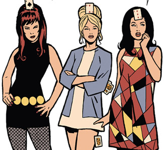
I think Aja’s art is simply amazing. I’ve commented on here before that I think Hawkeye is pulling from the the same place in our collective consciousness as Archer. It has a real 1960s spy movie feel, but it takes place today. I mean, look at the outfits the women in his life are wearing – it looks like something off of the set of Austin Powers.
I think you’re right about the color scheme and deceptively simplistic-looking art doing a great job of conveying this is Clint when he’s not at work.
Another interesting aspect to the story and art revolves around its setting. Most of Marvel’s super heroes live and work in New York City. An Uncanny X-Men Vol 2 issue even called attention to it – a cop had purposely moved to the midwest to get away from the hero and villain battles. While I’ve never lived there, I’ve spent a lot of time in The City. While Spider-Man and Fantastic Four (depending on the writer) try to make a big deal of showing their characters living in the city (and depicting boroughs and neighborhoods that make little sense to those without city experience), I feel like Hawkeye feels more like it actually takes place in New York City. And it’s not just that we don’t have an attack from The Negative Zone. It’s the way Aja draws the city and it’s the way Fraction depicts the natives. Like the “Hawkguy” hot dog vendor. And I’ve actually seen the Tracksuit Mafia in Brooklyn. There is indeed a subset of the Russian community that thinks Tracksuits are acceptable everyday wear (without being an athlete).
Hawkeye is one of the great examples in the Big Two (Batman is another) where the art not only doesn’t get in the way of the story, but it greatly enhances it.
Hawkeye really does make you feel like you’re familiar with the location, even if you’ve never been to New York City. Aja and Pulido do such an amazing job with the illustrations that there’s something familiar about the locale, something that makes you think that you’ve maybe been there before. I think it’s because Clint lives in the part of NYC that’s in every city – it isn’t falling over, not by any means, but it’s also not the best part of town. It’s recognizable without being iconic, which really helps.
I think part of what allows Hawkguy (as the kids call it) to be so successful at marrying authorial intent between its creative pieces is the interplay between Aja and Fraction. I don’t dislike Pulido’s work, but I am annoyed when Marvel’s aggressive schedule means that Aja doesn’t have enough time to do the art in the book.
A lot of Marvel’s other, more rapidly shipping titles shift artists all the time and you really feel the disconnect there. Hawkguy is not Hawkguy to me when it’s not Aja and Fraction like how Chew would be…bizarre without Layman and Guillory.
I know Marvel and DC like to keep tight schedules, but they really should reconsider their haphazard approach to artist/author assignment for the very simple reason that art is an integral part of the comic book experience. Only words makes a novel while only pictures makes an art book. Marrying the two on a more permanent basis allows for consistent style and allows creativity to flourish.
And, as you mentioned on the Batman post this week, a lot of comics today is driven by the graphic novel. How ridiculous is it when you have a collected trade with a bunch of different artists? That was the biggest complaint with X-Men Schism.
DC and Marvel seem to be firmly married to the idea of the monthly title being exactly that, and I’d say it’s to the detriment of those titles. Having fill-in artists is one way they deal with it – and I agree, Aja’s work in Hawkeye is my favorite as well – but the other option is filler issues. Batman Incorporated had a filler with its #11 issue, and having a filler in that title was incredibly disruptive. If you’re going to run a 12-issue mini with the purpose of telling the story of how Robin dies, don’t give us a random campy look at Batman Japan with only two issues to follow. I’d much rather have had to wait an extra month than to have that completely disconnected issue published in the middle.
It’s certainly a double-edged sword. Grant Morrison’s Happy lost some of its punch by being delayed a couple months. It was supposed to come out Christmas week – its story revolved around Christmas. And Joss Whedon’s run on Astonishing x-Men must have been annoying if one was reading it month to month.
On the other side, there’s the issues with not-Aja on Hawkeye and Fiona Staples’ art is so amazing on Saga that I’m perfectly fine (if a bit impatient) with the breaks in that series to allow for her to have the time she needs to work on the books. At least they’re handling it the right way – it’s better to have announced breaks rather than people wondering when a book is coming out.
[…] AMAZNIG Matt Fraction (see today’s post in which Kari explores his teamwork with Aja on Hawkeye) will be teaming up with Howard Chaykin for a new black and white series called Satellite Sam. […]
[…] Fraction’s Hawkeye is. Here at Comic POW! it was Dan’s best Marvel comic of 2012 and Kari explored the amazing art. But what is it about Hawkeye that’s so resonant right now? Yeah, Matt Fraction’s […]
[…] Gail Simone is a riot. I knew she was a little crazy on Twitter, but everyone’s a little crazy on Twitter. But Twitter seems to be pretty accurate to her awesome personality. What I really enjoyed about the vibe here at Baltimore Comic-Con is that attendees expressed their passion for characters that Simone has written while remaining completely respectful. Everyone respected when Simone could talk about things frankly and when she had to keep quiet (either because things weren’t ready to be revealed or out of professional courtesy). I don’t know if it’s just that the loudmouths make the news at the other conventions, but it was nice (compared to forums) for everyone to be gentlemen and ladies. Two big things I took away were that Gail Simone REALLY cares about the characters she writes and that she can sometimes scare herself with the stories she’s writing. Also, she’d like to makeover nearly all comic character hairdos. I wonder if she liked the 60s hair in Hawkeye? […]
[…] and David Aja Hawkeye book. I wrote about it here and contributor Kari Woodrow wrote about the art here. I was definitely looking forward to seeing how it was adapted to the […]